# Introduction
If you're working with backend language on your localhost, you would not like to write CSS to style default web elements.
Now either you will install bootstrap or any other UI framework on your localhost project but would you like to add bunch of classes to add stylings?
You are working on backend and probably you don't want to worry about front end design right now.
This is where sementic css framework like localhost UI helps you. That means you won't need to add classes to style elements.
What is sementic styling?
For instance, you want to add a button like this :
To generate this pre-sytled button, all you need to write the following default code of HTML
<button>Button</button>
Despite of being a sementic CSS framework, localhost UI is highly customizable according to your need.
# Setup
You can install localhost UI into your system via these following methods
1. Use the CDN (Easy way)
Copy this following link into <head></head> tags
<link rel="stylesheet" href="https://unpkg.com/localhost-ui/dist/index.css"> 2. via npm
npm i localhost-uito implement this into your javascript project like ReactJS, Import the module like this :
import 'localhost-ui'After adding localhost UI into your practice project, you can play with your backend without worrying about styling.
# Layout
localhost is based on 12-grid sytem layout but you can also use flexbox Utilities to get desired results.
Most used grid is column 6/6
Here are how to use localhost-ui to plan layout for your website
<div class="row">
<div class="col-1">col-1</div>
<div class="col-11">col-11</div>
</div> <div class="row">
<div class="col-2">col-2</div>
<div class="col-10">col-10</div>
</div> <div class="row">
<div class="col-3">col-3</div>
<div class="col-9">col-9</div>
</div> <div class="row">
<div class="col-4">col-4</div>
<div class="col-8">col-8</div>
</div> <div class="row">
<div class="col-5">col-5</div>
<div class="col-7">col-7</div>
</div> <div class="row">
<div class="col-6">col-6</div>
<div class="col-6">col-6</div>
</div> <div class="row">
<div class="col-12">col-12</div>
<div class="col-12">col-12</div>
</div> # Containers
Containers are required to seprate website components.
You have to use class .container for div element to make it a container.
Containers in localhost-ui are given padding of 1rem which is essential to give white space between components
There are three kinds of containers are available here : default container, container-1280, container-980
Default Container
It is flexible container with 100% width. It takes full-width of the parent element
<div class="container">Default Container</div> Container 1280
Container 1280 is a continer with max-width of 1280px, that means if screen-size exceeds 1280px, it will maintain fixed width of 1280px.
If screen size is less than 1280px, it will aquire full width of the screen and work like a default container
<div class="container-1280">Container 1280</div> Container 980
Container 980 is a continer with max-width of 980px, that means if screen-size exceeds 980px, it will maintain fixed width of 980px.
If screen size is less than 980px, it will aquire full width of the screen and work like a default container
<div class="container-980">Container 980</div> Container 720
Container 720 is a continer with max-width of 720px, that means if screen-size exceeds 720px, it will maintain fixed width of 720px.
If screen size is less than 720px, it will aquire full width of the screen and work like a default container
<div class="container-720">Container 720</div> Try minimizing browser's screen using CTRL - up to 50% to see containers in action.
# Typography
Responsive & fluid typography is used which is fully sementic and class-less.
You don't have to change font-size or line-height for various screens, so that you can just focus on your learnings
Here are Typography conponents :
Headings
Heading one h1
Heading two h2
Heading three h3
Heading four h4
Heading five h5
Heading six h6
This is a paragraph line
<h1>Heading one h1</h1>
<h2>Heading two h2</h2>
<h3>Heading three h3</h3>
<h4>Heading four h4</h4>
<h5>Heading five h5</h5>
<h6>Heading six h6</h6>
<p>This is a paragraph line</p>
# Utilities
localhost UI has some sementic and class based elements or utilities that will help you to achieve styling without wrting extra css for them
Alert
This is info alert!
This is error alert!
This is success alert!
This is warning alert!
<p class="alert-info">This is info alert!</p>
<p class="alert-error">This is error alert!</p>
<p class="alert-success">This is success alert!</p>
<p class="alert-warning">This is warning alert!</p>
Text Colors
This is info text
This is error text
This is success text
This is warning text
This is gray text
This is dark text
This is light text
This is display text
<p class="text-info">This is info text</p>
<p class="text-error">This is error text</p>
<p class="text-success">This is success text</p>
<p class="text-warning">This is warning text</p>
<p class="text-gray">This is gray text</p>
<p class="text-dark">This is dark text</p>
<p class="text-light">This is light text</p>
<p class="text-display">This is display text</p>
Text Alignment
Text Left
Lorem ipsum dolor sit, amet consectetur adipisicing elit. Temporibus minus beatae quia perferendis dignissimos nulla animi ex, unde facilis, ratione, consequatur at qui iusto. Tenetur earum veritatis qui perferendis asperiores?
<p class="text-left">Lorem ipsum dolor sit, amet consectetur adipisicing elit. Temporibus minus beatae quia perferendis dignissimos nulla animi ex, unde facilis, ratione, consequatur at qui iusto. Tenetur earum veritatis qui perferendis asperiores?</p>
Text Center
Lorem ipsum dolor sit, amet consectetur adipisicing elit. Temporibus minus beatae quia perferendis dignissimos nulla animi ex, unde facilis, ratione, consequatur at qui iusto. Tenetur earum veritatis qui perferendis asperiores?
<p class="text-center">Lorem ipsum dolor sit, amet consectetur adipisicing elit. Temporibus minus beatae quia perferendis dignissimos nulla animi ex, unde facilis, ratione, consequatur at qui iusto. Tenetur earum veritatis qui perferendis asperiores?</p>
Text Right
Lorem ipsum dolor sit, amet consectetur adipisicing elit. Temporibus minus beatae quia perferendis dignissimos nulla animi ex, unde facilis, ratione, consequatur at qui iusto. Tenetur earum veritatis qui perferendis asperiores?
<p class="text-right">Lorem ipsum dolor sit, amet consectetur adipisicing elit. Temporibus minus beatae quia perferendis dignissimos nulla animi ex, unde facilis, ratione, consequatur at qui iusto. Tenetur earum veritatis qui perferendis asperiores?</p>
Text Justify
Lorem ipsum dolor sit, amet consectetur adipisicing elit. Temporibus minus beatae quia perferendis dignissimos nulla animi ex, unde facilis, ratione, consequatur at qui iusto. Tenetur earum veritatis qui perferendis asperiores?
<p class="text-justify">Lorem ipsum dolor sit, amet consectetur adipisicing elit. Temporibus minus beatae quia perferendis dignissimos nulla animi ex, unde facilis, ratione, consequatur at qui iusto. Tenetur earum veritatis qui perferendis asperiores?</p>
Text Formatting
This is a bold text
This is a strong text
This is an Underlined text
This is a hyperlink text
This is an italic text
This is a highlighted text
This is a small text
This is a superscripted text
This is a subscripted text
This is a inserted text
This is a deleted text
<p>This is a <b>bold</b> text </p>
<p>This is a <strong>strong</strong> text </p>
<p>This is an <u>Underlined</u> text </p>
<p>This is a <a href="#!">hyperlink</a> text </p>
<p>This is an <i>italic</i> text</p>
<p>This is a <mark>highlighted</mark> text</p>
<p>This is a <small>small</small> text</p>
<p>This is a <sup>superscripted</sup> text</p>
<p>This is a <sub>subscripted</sub> text</p>
<p>This is a <ins>inserted</ins> text</p>
<p>This is a <del>deleted</del> text</p>
This is code text
This is a Keyboard key
This is a computer output
This is a variable
This is a citation
This is a short quotation
This is an abbreviation
This is a definition
Time is now
Address is :
123 Fake StreetSpringfield, USA
<p>This is <code>code</code> text</p>
<p>This is a <kbd>Keyboard</kbd> key</p>
<p>This is a <samp>computer output</samp></p>
<p>This is a <var>variable</var></p>
<p>This is a <cite>citation</cite></p>
<p>This is a <q>short quotation</q></p>
<p>This is an <abbr>abbreviation</abbr></p>
<p>This is a <dfn>definition</dfn></p>
<p>Time is now <time>10:00pm</time></p>
<p>Address is : <address>123 Fake Street<br/>Springfield, USA</address></p>
Blockquote
To add quotes you can use blockquote tag like this :
This world shall know pain! - Pain from Naruto Shippuden
<blockquote>
This world shall know pain!
<cite>- Pain from Naruto Shippuden</cite>
</blockquote>
Font Weight
You can change font-weight by adding a fw-xxx to class attribute of the element, like this
Font Weight 100
Font Weight 200
Font Weight 300
Font Weight 400
Font Weight 500
Font Weight 600
Font Weight 700
Font Weight 800
Font Weight 900
<p class="fw-100">Font Weight 100</p>
<p class="fw-200">Font Weight 200</p>
<p class="fw-300">Font Weight 300</p>
<p class="fw-400">Font Weight 400</p>
<p class="fw-500">Font Weight 500</p>
<p class="fw-600">Font Weight 600</p>
<p class="fw-700">Font Weight 700</p>
<p class="fw-800">Font Weight 800</p>
<p class="fw-900">Font Weight 900</p>
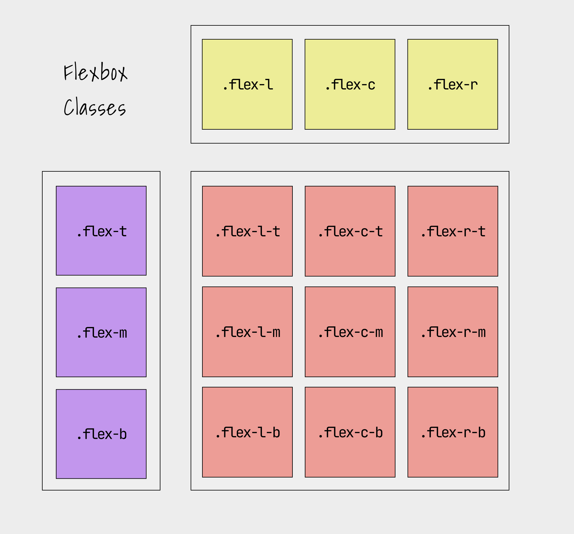
# Flexbox
In localhost UI, flexbox is class-atributes based and simplified to a good extent.
Add following classes into your element to get flexbox layout
| Class | What it will do |
|---|---|
| .flex-l | { display: flex; justify-content: flex-start; } |
| .flex-c | { display: flex; justify-content: center; } |
| .flex-r | { display: flex; justify-content: flex-end; } |
| .flex-t | { display: flex; align-items: flex-start; } |
| .flex-m | { display: flex; align-items: center; } |
| .flex-b | { display: flex; align-items: flex-end; } |
| .flex-sa | { display: flex; justify-content: space-around; } |
| .flex-sb | { display: flex; justify-content: space-between; } |
| .flex-str | { display: flex; align-items: stretch; } |
| .flex-col | { display: flex; flex-direction: column; } |
| .flex-row | { display: flex; flex-direction: row; } |
| .flex-wrap | { display: flex; flex-wrap: wrap; } |
Here is a chart to tell about these flexbox classes
Item
<div class="flex-l">
  <p>Item</p>
</div>
Item
<div class="flex-c">
  <p>Item</p>
</div>
Item
<div class="flex-r">
  <p>Item</p>
</div>
You can combination of those flex classes to get desired results
Item
<div class="flex-c-m">
  <p>Item</p>
</div>
# Lists
There are three kinds of lists in HTML : ordered list, un-ordered list, defination lists
Here are all sementic list components
1. Ordered list
-
List item one
- Nested list item
- List item two
- List item three
<ol>
<li>
  List item one
  <ol>
    <li>Nested list item</li>
  </ol>
</li>
<li>List item two</li>
<li>List item three</li>
</ol>
2. Unordered list
-
List item one
- Nested list item
- List item two
- List item three
<ul>
<li>
  List item one
  <ul>
    <li>Nested list item</li>
  </ul>
</li>
<li>List item two</li>
<li>List item three</li>
</ul>
3. Definition list
- Definition One
- Definition one description
- Definition Two
- Definition two description
<dl>
<dt>Definition One</dt>
<dd>Definition one description</dd>
<dt>Definition Two</dt>
<dd>Definition two description</dd>
</dl>
# Table
Sementic and basic table syling using localhost-ui
| Head 1 | Head 2 |
|---|---|
| Description 1 | Description 2 |
| Description 1 | Description 2 |
| Footer 1 | Footer 2 |
<table>
<thead>
  <tr>
    <th>Head 1</th>
    <th>Head 2</th>
  </tr>
</thead>
<tbody>
  <tr>
    <td>Description 1</td>
    <td>Description 2</td>
  </tr>
  <tr>
    <td>Description 1</td>
    <td>Description 2</td>
  </tr>
</tbody>
<tfoot>
    <tr>
      <th>Footer 1</th>
      <th>Footer 2</th>
    </tr>
  </tfoot>
</table>
# Buttons
There are three patterns of buttons given here : default, lined and round.
Buttons can be generated using three tags : <input>, <button>, <a>
Hence, here are all kind of buttons you can use.
Use lined buttons for accent/secondary buttons
Using <input> tag:
<input type="button" value="Button"/>
<input type="submit" value="Submit" />
<input type="reset" value="Reset" />
Using <button> tag:
<button>Button Element</button>
<button class="button-line">Button line</button>
<button class="button-round">Button round</button>
<button class="button-round-line">Button round line</button>
Using <a>(anchor) tag:
# Form
Forms in localhost-ui are made so simple and designed for better ease.
All kinds of form input types are given with their sementic code
<label for="text">Text Input</label>
<input id="text" type="text" placeholder="Text Input" /> <label for="password">Password</label>
<input id="password" type="password" placeholder="Password" /> <label for="url">URL</label>
<input id="url" type="url" placeholder="http://www.example.com"/> <label for="email">Email Address</label>
<input id="email" type="email" placeholder="email@example.com" /> <label for="phone">Phone Number</label>
<input id="phone" type="tel" placeholder="123-123-1234" /> <label for="search">Search</label>
<input id="search" type="search" placeholder="Search" /> <label for="number">Number</label>
<input id="number" type="number" placeholder="Number" /> <label for="select">Select</label>
<select id="select">
<option>Option One</option>
<option>Option Two</option>
<option>Option Three</option>
</select> <label for="checkbox1">
<input id="checkbox1" name="checkbox" type="checkbox" checked="checked" /> Choice A
</label>
<label for="checkbox2">
<input id="checkbox2" name="checkbox" type="checkbox" /> Choice B
</label> <label for="radio1">
<input id="radio1" name="radio" type="radio" class="radio" checked="checked" /> Option 1
</label>
<label for="radio2">
<input id="radio2" name="radio" type="radio" class="radio" /> Option 2
</label> <label for="textarea">Textarea</label>
<textarea id="textarea" rows="5" cols="30" placeholder="Message"></textarea> Fieldset and legend form
<form>
<fieldset>
<legend>Legend</legend>
<label for="text">Text Input</label>
<input id="text" type="text" placeholder="Text Input" />
</fieldset>
</form> Let's make a simple login form
<form>
<label for="email">Email Address</label>
<input id="email" type="email" placeholder="email@example.com" />
<label for="password">Password</label>
<input id="password" type="password" placeholder="Password" />
<input type="submit" value="Login">
</form>